Figures S1-S8: All 172 test velocity maps
Contents
Figures S1-S8: All 172 test velocity maps
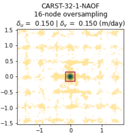
The label of each panel in Figures S1-S8 indicates the corresponding parameter combination, formatted as (Software)-(Template size)-(Pixel spacing)-(Prefilter). For Vmap results, the subpixel method is also shown in the label. See Table S1 for parameter abbrevations.
To reproduce these figures, see bottom of this page.
 Figure S1.
 LS8-20180304-20180405.
 Figure S2.
 LS8-20180304-20180405.
 Figure S3.
 LS8-20180802-20180818.
 Figure S4.
 LS8-20180802-20180818.
 Figure S5.
 Sen2-20180304-20180314.
 Figure S6.
 Sen2-20180304-20180314.
 Figure S7.
 Sen2-20180508-20180627.
 Figure S8.
 Sen2-20180508-20180627.
Code for reproducing the figures
import pandas as pd
import glaft
import matplotlib as mpl
import matplotlib.pyplot as plt
#### Font and line width settings ####
font = {'size'   : 13}
mpl.rc('font', **font)
axes_settings = {'linewidth'   : 2}
mpl.rc('axes', **axes_settings)

def plot_batch(sub_df, component: str='Vx', datestr: str=''):
    """
    Plot all Vx or Vy maps from the same image pair.
    """
    fig, axs = plt.subplots(8, 6, figsize=(20, 21), constrained_layout=True)
    n = 0
    for idx, row in sub_df.iterrows():
        templatesize = row['Template size (px)']
        # change long GIV label "varying: multi-pass" to "multi"
        templatesize = 'multi' if templatesize == 'varying: multi-pass' else templatesize
        if row.Software == 'Vmap':
            label = '-'.join((row.Software, templatesize, row['Pixel spacing (px)'], row.Prefilter)) + '\n' + row.Subpixel
        else:
            label = '-'.join((row.Software, templatesize, row['Pixel spacing (px)'], row.Prefilter))
        ax_sel = axs[n // 6, n % 6]
        glaft.show_velocomp(row[component], ax=ax_sel)
        ax_sel.set_title(label)
        n += 1

    # delete empty axes
    for i in range(n, 48):
        ax_sel = axs[i // 6, i % 6]
        fig.delaxes(ax_sel)

    # add a colorbar in the bottom
    if component == 'Vx':
        cbar_label = '$V_x$ (m/day)'
    elif component == 'Vy':
        cbar_label = '$V_y$ (m/day)'
    cbar_label = datestr + '\n' + cbar_label
    cax = fig.add_axes([0.2, 0.09, 0.17, 0.017])

    mappable = glaft.prep_colorbar_mappable()
    fig.colorbar(mappable, cax=cax, orientation='horizontal', label=cbar_label)

    return fig, axs
To reproduce the figures:
download the source velocity maps from https://doi.org/10.17605/OSF.IO/HE7YR
locate
notebooks/manifest.csvupdate the
VxandVycolumns with the downloaded file pathsuncomment and run the cell below.
# df = pd.read_csv('../manifest.csv', dtype=str)
# datestrs = ['LS8-20180304-20180405',
#             'LS8-20180802-20180818',
#             'Sen2-20180304-20180314',
#             'Sen2-20180508-20180627']

# for datestr in datestrs:
#     sub_df = df.loc[df['Date'] == datestr]
#     for component in ['Vx', 'Vy']:
#         fig, axs = plot_batch(sub_df, component=component, datestr=datestr)
#         fig.patch.set_facecolor('xkcd:white')
#         fig.savefig('figs/{}-{}.png'.format(datestr, component))