Figure 6
Contents
Figure 6
This notebook produces all subpanels of Figure 6, other auxillary figures, and the related statistical analysis.
import seaborn as sns
import pandas as pd
import matplotlib
from scipy import stats
Get data
We load the data produced by the previous workflow stored as ../data/results/pej0_GrIS_classification.csv. See Fig5.ipynb for more details.
df = pd.read_csv('../data/results/pej0_GrIS_classification.csv')
df
| $\frac{P_e}{\ell}$ (m$^{-1}$) | $J_0$ (m yr$^{-1}$) | Speed diff (m yr$^{-1}$) | Speed diff (%) | Advance (km) | |
|---|---|---|---|---|---|
| 0 | 0.000021 | -915.378881 | 3029.186179 | 66.610459 | -17.0 |
| 1 | 0.000306 | -200.805053 | 511.123464 | 84.192696 | -2.3 |
| 2 | -0.000047 | -82.857761 | 456.284207 | 55.293407 | -3.0 |
| 3 | -0.000034 | -450.936824 | -435.655180 | -12.603562 | -0.3 |
| 4 | 0.000078 | -1243.208582 | -349.572187 | -8.164585 | -0.2 |
| ... | ... | ... | ... | ... | ... |
| 99 | 0.000234 | -112.716518 | 613.747370 | 34.516832 | -0.9 |
| 100 | 0.000044 | -167.859915 | 1023.168837 | 55.202543 | -4.1 |
| 101 | 0.000054 | -1081.388452 | 2774.927415 | 51.468309 | -8.8 |
| 102 | 0.000315 | 5.479272 | 467.138448 | 31.283371 | -0.9 |
| 103 | 0.000231 | -222.535111 | 573.128198 | 41.697811 | -4.1 |
104 rows × 5 columns
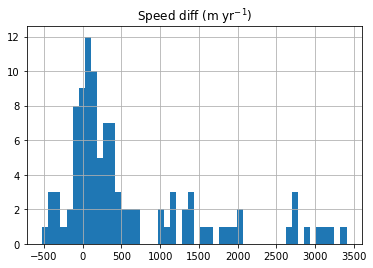
This histogram gives a quick idea about the distribution of speed change in both absolute difference (the first histogram) and percentage difference (the second histogram). We use the absolute difference for the following analysis because it shows many outliers away from the peaked distribution centered at around 0 m/yr.
df.hist(column='Speed diff (m yr$^{-1}$)', bins=50);
df.hist(column='Speed diff (%)', bins=50);
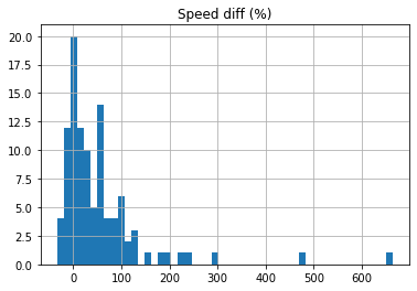
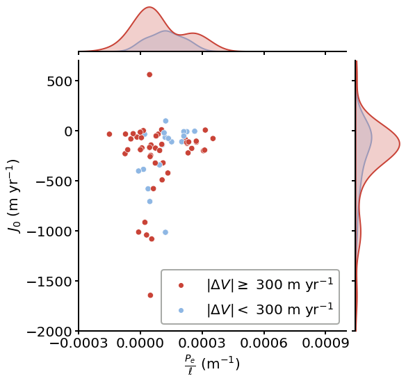
Figure 6A
Visualization
We add a new column called Legend and classify the glaciers based on a simple threshold of speed change (here set to \(\pm\)300 m/yr):
newclass = []
count = 0
for idx, row in df.iterrows():
    if row['Speed diff (m yr$^{-1}$)'] >= 300 or row['Speed diff (m yr$^{-1}$)'] <= -300:
        newclass.append(r'$|\Delta V| \geq$ 300 m yr$^{-1}$')
        count += 1
    else:
        newclass.append(r'$|\Delta V| <$ 300 m yr$^{-1}$')

df['Legend'] = newclass
print('How many glaciers have a higher speed change?: {}'.format(count))
print('How many glaciers have a lower speed change?:  {}'.format(len(df) - count))
How many glaciers have a higher speed change?: 54
How many glaciers have a lower speed change?:  50
Now we plot Figure 6A:
matplotlib.rc('font', size=20)
matplotlib.rc('axes', linewidth=2)

cmap = {r'$|\Delta V| \geq$ 300 m yr$^{-1}$': '#C94337', r'$|\Delta V| <$ 300 m yr$^{-1}$': '#8EB7E4'}
f = sns.jointplot(data=df, x=r'$\frac{P_e}{\ell}$ (m$^{-1}$)', y=r'$J_0$ (m yr$^{-1}$)', hue="Legend", palette=cmap,
                  joint_kws={"s": 70, }, marginal_kws={'linewidth': 2}, height=8)
f.ax_joint.set_xlim([-0.0003, 0.0010])
f.ax_joint.set_ylim([-2000, 700])
f.ax_joint.set_xticks([-0.0003, 0, 0.0003, 0.0006, 0.0009])
f.ax_joint.tick_params(width=2, length=5)
f.ax_marg_x.tick_params(width=2, length=5)
f.ax_marg_y.tick_params(width=2, length=5)
legend = f.ax_joint.legend(loc='lower right')
legend.get_frame().set_linewidth(2)
legend.get_frame().set_edgecolor('xkcd:gray')
f.savefig('../data/results/Fig6-1.pdf')
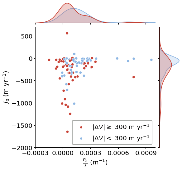
Statistical analysis
We use the two-sample Kolmogorov-Smirnov test to determine if the two kernel distributions shown in Figure 6A are drawn from the same probability distribution. The test is one dimensional, so we need to perform this twice, one for each axis.
unstable_j0 = df[df['Legend'] == r'$|\Delta V| \geq$ 300 m yr$^{-1}$'][r'$J_0$ (m yr$^{-1}$)']
unstable_pe = df[df['Legend'] == r'$|\Delta V| \geq$ 300 m yr$^{-1}$'][r'$\frac{P_e}{\ell}$ (m$^{-1}$)']
stable_j0 = df[df['Legend'] == r'$|\Delta V| <$ 300 m yr$^{-1}$'][r'$J_0$ (m yr$^{-1}$)']
stable_pe = df[df['Legend'] == r'$|\Delta V| <$ 300 m yr$^{-1}$'][r'$\frac{P_e}{\ell}$ (m$^{-1}$)']
We use the kstest fuction from the scipy package and perform a two-sided Kolmogorov–Smirnov test. The p value is sufficiently small to reject the null hypothesis that both kernels are drawn from the same probability distribution under a 95% confidence level.
stats.kstest(unstable_j0, stable_j0)
KstestResult(statistic=0.3451851851851852, pvalue=0.0028360448053456055)
stats.kstest(unstable_pe, stable_pe)
KstestResult(statistic=0.3237037037037037, pvalue=0.006217578940975077)
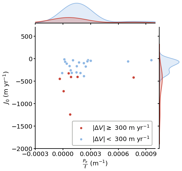
Figure 6B
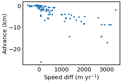
First, this scatter plot shows how speed change and terminal retreat correlate to each other, motivating the needs to isolate that forcing in Figures 6B-C:
df.plot(x='Speed diff (m yr$^{-1}$)', y='Advance (km)', kind='scatter')
<AxesSubplot:xlabel='Speed diff (m yr$^{-1}$)', ylabel='Advance (km)'>
First, let’s select glaciers with retreat > 0.5 km and plot them in Figure 6B using the same way as Figure 6A.
df_1 = df.loc[df['Advance (km)'] < -0.5]

cmap = {r'$|\Delta V| \geq$ 300 m yr$^{-1}$': '#C94337', r'$|\Delta V| <$ 300 m yr$^{-1}$': '#8EB7E4'}
f = sns.jointplot(data=df_1, x=r'$\frac{P_e}{\ell}$ (m$^{-1}$)', y=r'$J_0$ (m yr$^{-1}$)', hue="Legend", palette=cmap,
                  joint_kws={"s": 70, }, marginal_kws={'linewidth': 2}, height=8)
f.ax_joint.set_xlim([-0.0003, 0.0010])
f.ax_joint.set_ylim([-2000, 700])
f.ax_joint.set_xticks([-0.0003, 0, 0.0003, 0.0006, 0.0009])
f.ax_joint.tick_params(width=2, length=5)
f.ax_marg_x.tick_params(width=2, length=5)
f.ax_marg_y.tick_params(width=2, length=5)
legend = f.ax_joint.legend(loc='lower right')
legend.get_frame().set_linewidth(2)
legend.get_frame().set_edgecolor('xkcd:gray')
f.savefig('../data/results/Fig6-2.pdf')
Below is the same statistical test for this subset. Separation of \(P_e / \ell\) is still significant, but \(J_0\) is not.
unstable_j0_1 = df_1[df_1['Legend'] == r'$|\Delta V| \geq$ 300 m yr$^{-1}$'][r'$J_0$ (m yr$^{-1}$)']
unstable_pe_1 = df_1[df_1['Legend'] == r'$|\Delta V| \geq$ 300 m yr$^{-1}$'][r'$\frac{P_e}{\ell}$ (m$^{-1}$)']
stable_j0_1 = df_1[df_1['Legend'] == r'$|\Delta V| <$ 300 m yr$^{-1}$'][r'$J_0$ (m yr$^{-1}$)']
stable_pe_1 = df_1[df_1['Legend'] == r'$|\Delta V| <$ 300 m yr$^{-1}$'][r'$\frac{P_e}{\ell}$ (m$^{-1}$)']
stats.kstest(unstable_j0_1, stable_j0_1)
KstestResult(statistic=0.24154589371980675, pvalue=0.3662958100582304)
stats.kstest(unstable_pe_1, stable_pe_1)
KstestResult(statistic=0.36231884057971014, pvalue=0.04984912204217817)
Figure 6C
Now let’s select glaciers with retreat < 0.5 km and plot them in Figure 6C using the same way as Figure 6A.
df_2 = df.loc[df['Advance (km)'] > -0.5]

cmap = {r'$|\Delta V| \geq$ 300 m yr$^{-1}$': '#C94337', r'$|\Delta V| <$ 300 m yr$^{-1}$': '#8EB7E4'}
f = sns.jointplot(data=df_2, x=r'$\frac{P_e}{\ell}$ (m$^{-1}$)', y=r'$J_0$ (m yr$^{-1}$)', hue="Legend", palette=cmap,
                  joint_kws={"s": 70, }, marginal_kws={'linewidth': 2}, height=8)
f.ax_joint.set_xlim([-0.0003, 0.0010])
f.ax_joint.set_ylim([-2000, 700])
f.ax_joint.set_xticks([-0.0003, 0, 0.0003, 0.0006, 0.0009])
f.ax_joint.tick_params(width=2, length=5)
f.ax_marg_x.tick_params(width=2, length=5)
f.ax_marg_y.tick_params(width=2, length=5)
legend = f.ax_joint.legend(loc='lower right')
legend.get_frame().set_linewidth(2)
legend.get_frame().set_edgecolor('xkcd:gray')
f.savefig('../data/results/Fig6-3.pdf')
Below is the same statistical test for this subset. Separation of \(J_0\) is now significant, but \(P_e / \ell\) is not.
unstable_j0_2 = df_2[df_2['Legend'] == r'$|\Delta V| \geq$ 300 m yr$^{-1}$'][r'$J_0$ (m yr$^{-1}$)']
unstable_pe_2 = df_2[df_2['Legend'] == r'$|\Delta V| \geq$ 300 m yr$^{-1}$'][r'$\frac{P_e}{\ell}$ (m$^{-1}$)']
stable_j0_2 = df_2[df_2['Legend'] == r'$|\Delta V| <$ 300 m yr$^{-1}$'][r'$J_0$ (m yr$^{-1}$)']
stable_pe_2 = df_2[df_2['Legend'] == r'$|\Delta V| <$ 300 m yr$^{-1}$'][r'$\frac{P_e}{\ell}$ (m$^{-1}$)']
stats.kstest(unstable_j0_2, stable_j0_2)
KstestResult(statistic=0.95, pvalue=1.8017409321613442e-05)
stats.kstest(unstable_pe_2, stable_pe_2)
KstestResult(statistic=0.4142857142857143, pvalue=0.25506683332770297)